Why a confirmation dialog?
If there is one component you will always need, whatever your application is about, it is a confirmation dialog. They are ubiquitous; whether you want to delete an entry, gather consent, or simply alert the user that a process will take some time.
In this post, I will walk through the design and development of my version of a confirmation dialog component.
It is not the only one; there are many tutorials out there covering the same subject, and you might even have a different vision of what constitutes a good confirmation dialog.
What is a confirmation dialog?
That seems like a trivial question, but the answer is crucial for designing the component properly.
A confirmation dialog is a window shown to the user when we need their confirmation to proceed with the current action. The action itself is not really relevant and can be anything. The classic use-case is deleting a record in the database.
With that definition, we can outline the main features of a confirmation dialog:
- Display information about what the user needs to confirm.
- A confirm button with a callback function to execute the confirmed action.
- A cancel button that closes the dialog.
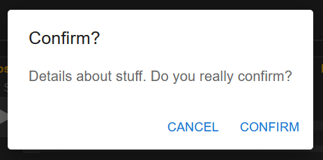
We all know how it looks, but saying — or showing in this case — the obvious is sometimes a good thing:
What the component’s code looks like
Create a new file named ConfirmDialog.js.
For this component, I am using Material-UI for all the styling. However, you can use whatever you prefer; the code will not change significantly.
I will provide the code here and explain it afterward.
1 | import * as React from 'react'; |
As you can see, most of the component’s behavior is managed by the caller rather than the component itself. This might seem evident upon consideration, but as mentioned earlier, stating the obvious can still be beneficial.
While I could delve into explaining all the props here, some are relatively self-explanatory. You probably already understand the purposes of title, content, cancelButtonText, and confirmButtonText.
Here’s a brief rundown of the other props:
onConfirm: This prop is a callback function triggered when the confirmation button is clicked.openState/setOpenState: These props consist of the open state and the corresponding state-setting function from the caller component. They are used to control the visibility of the confirmation dialog, either opening it or closing it.onCancel: By default set tonull, this prop offers a callback function for the cancel button click. It accommodates scenarios where more than just closing the dialog is necessary, covering those specific requirements.
Implementation
Here’s an example illustrating the usage of the component:
1 | import React, {useState} from "react"; |
Now you can test it out and determine if this approach suits your needs.
Conclusion (kind of)
That is a straightforward component, and there are opportunities for enhancements. For instance, currently, pressing the ‘Escape’ key on your keyboard will close the confirmation dialog, but pressing ‘Enter’ doesn’t have any effect.
Furthermore, the UI/UX could be enhanced further. You have the option to incorporate animations or customize the CSS for a more polished appearance.
If you’ve read through this entire post, I appreciate your attention, and I hope you found this information valuable.